
1. Visualizations
A visualization is a saved chart or table built on a dataset. You choose a chart type, pick a dataset, map its columns to the chart (axes, series, labels) and style it. Saved visualizations can be placed on dashboards (chapter 3), opened by AI agents and referenced by the AI assistant.
Before you start you need at least one dataset (see the Build and Run guide) and the Visualization and Dataset permissions. If a toast says "You are not authorized to perform this action", ask your administrator for them (Administration guide, chapter 4).
Choose the right chart for your question#
Start from the question you want the chart to answer. Groundzero has 22 chart types.
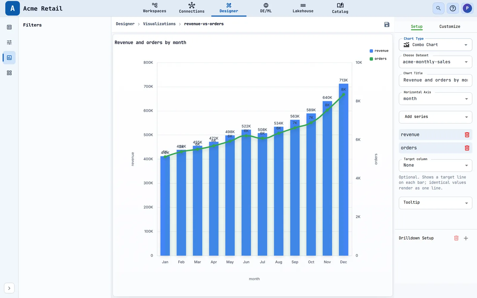
How do categories compare? (sales by region, orders by channel) - Bar draws one bar per category along the vertical axis. It suits long category names. It can also show a target line. - Vertical Bar draws columns along the horizontal axis. It suits a few short categories. - Stacked Bar and Stacked Vertical Bar split each bar into series, so you see the total and its parts together. - Combo puts bars and a line in one chart, for example orders as bars and revenue as a line.
How does something change over time? (monthly revenue) - Line is the usual choice. Turn on Add Dual Axis to plot two measures with different scales, or Stacked Area Chart to stack the lines as areas. - Candle shows low, open, close and high values for each period. - Combo can show a count as bars with a trend as a line.
What share of the whole is each part? (revenue by category) - Pie, Donut and Half Donut show shares of a total. Donut and Half Donut can print the total in the centre. - Tree Map shows shares as nested rectangles and copes with many categories. - Sunburst shows shares across levels of a hierarchy, such as region, then country, then city.
How am I doing against a target? (sales against quota) - Gauge shows one value on a dial with a maximum and coloured ranges. - Scorecard (listed as Card Chart) shows one or more big numbers with labels and an optional sparkline.
How are two or three measures related? (price against units sold) - Scatter plots one measure against another. - Bubble adds a third measure as the size of each dot.
Where do people drop out, or how does volume flow? - Funnel shows stages in order, such as visit, cart, order. - Sankey shows how volume flows from a source to a target. - Graph shows links between items as a network of nodes and edges.
Where is it? - Geo colours regions of a map by a value.
I need the exact numbers. - Table shows rows with optional groups, totals and a small trend chart in each cell. - Pivot lets readers see one measure across rows and columns, with totals.
Tip
Groundzero does not total or average data inside the chart (apart from Pivot and table totals). Aggregate in the dataset query, then chart the result.
Open the Visualizations list#
- Open Designer in the top navigation.
- In the left rail choose Visualizations. The rail also has Datasets, Filters and Dashboards.

| Control | What it does |
|---|---|
| Search Visualizations | Filters the list by name as you type. |
| Chart Type | "All types" plus every chart type present in the list. Choosing one adds a chip such as Type: Bar Chart. |
| Created By | "All users" or one creator. |
| Created On | Any time, Today, Last 7 days or Last 30 days. |
| New Visualization | Opens the Add Visualization dialog. |
| Actions (three dots) | Rename or Delete a row. |
Columns are Name (a link that opens the editor), Chart Type, Last Updated By and Last Updated On (in your local time), sorted by last update. When nothing exists you see "No visualizations to show". When your filters hide every row you see "No matches found".

Build a chart from a dataset#
Outcome: a saved chart that always shows live data.
- In Designer > Visualizations, choose New Visualization.
- In Enter Name type a name that follows the naming rule. While the name is invalid, red text appears and Add stays disabled.
- Choose Add. A toast confirms "<name> added successfully" and the new row appears. Groundzero does not open it for you.
- Choose the new name to open the editor.
- In the right pane, on the Setup tab, choose a Chart Type, then a dataset under Choose Dataset, then fill the fields that appear (see the field reference below).
- Choose the floppy-disk icon above the chart to save. The toast says Visualization updated.

A new visualization has no chart type and no dataset until you choose them in the editor.
How to check it worked: the chart draws on the canvas, and reopening it from the list shows the same chart with current data.
Note
Save before you leave the editor. Groundzero does not store the chart's rows. It re-runs the dataset each time the chart opens, so a saved chart always shows live data.
The editor#
The editor has three areas.
- Filters (left) shows the filter controls attached to the dataset (chapter 2). It is empty when the dataset has none.
- Canvas (centre) shows the breadcrumb
Designer > Visualizations > <name>, the Save icon and the chart. An empty canvas says "Complete Chart Setup". - Right pane has the tabs Setup and Customize.
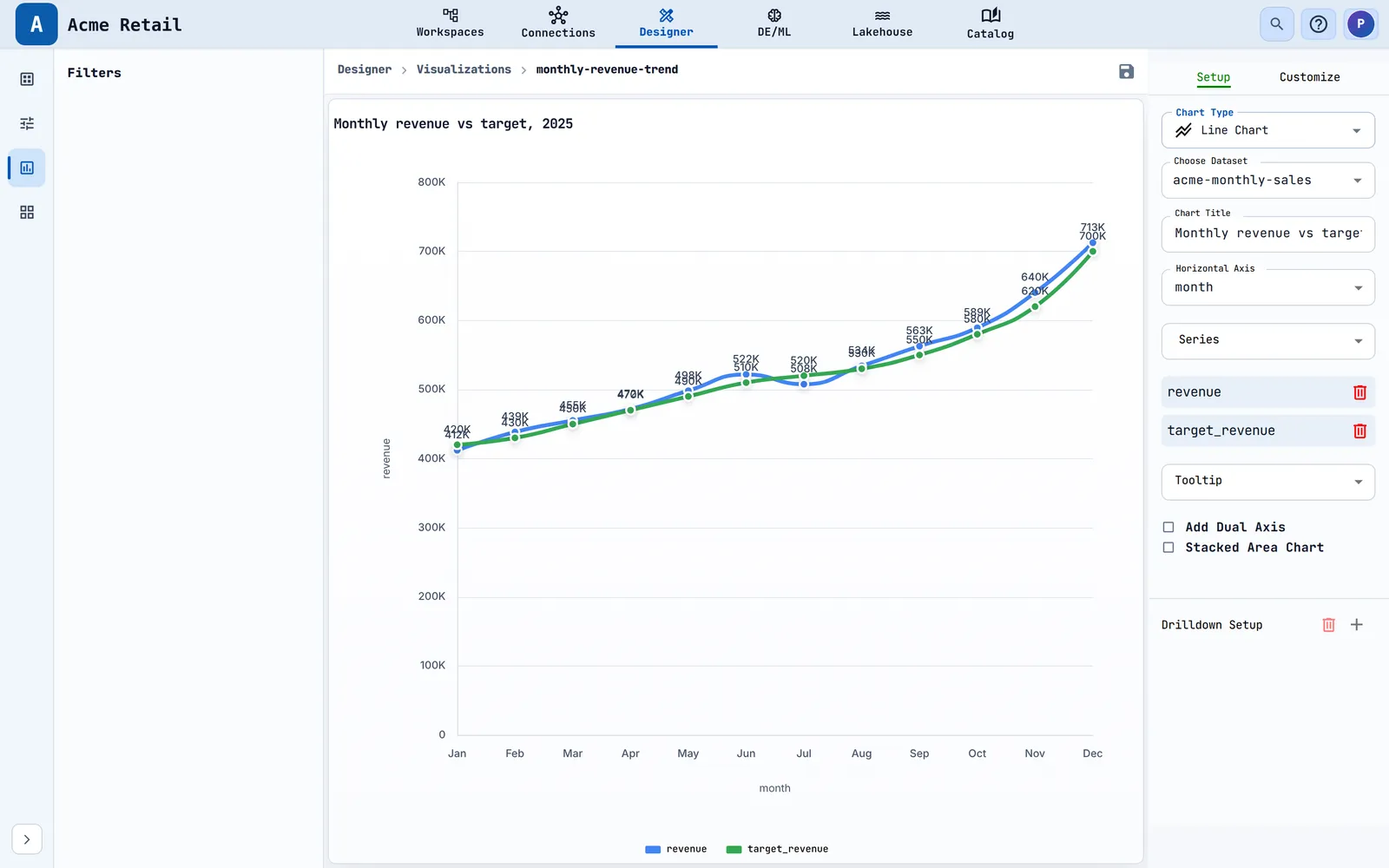
The Setup tab, top to bottom#
- Chart Type. Choose the field to open an icon grid and hover an icon to see its name. Picking a type resets the chart configuration for that type but keeps the dataset.
- Choose Dataset. A searchable list of all datasets ("Loading datasets..." while it loads). Choosing a dataset clears your series and column choices and fills the field lists from the dataset.
- Chart-specific fields appear once the columns load (reference below).
- Drilldown Setup (not for Pivot and Gauge). See "Let readers drill into detail".

Series lists offer numeric columns only. Choosing the same series twice shows "Column added already."
Setup fields for each chart type#
| Chart | Setup fields |
|---|---|
| Bar | Chart Title, Vertical Axis, Series, target-line column, Tooltip |
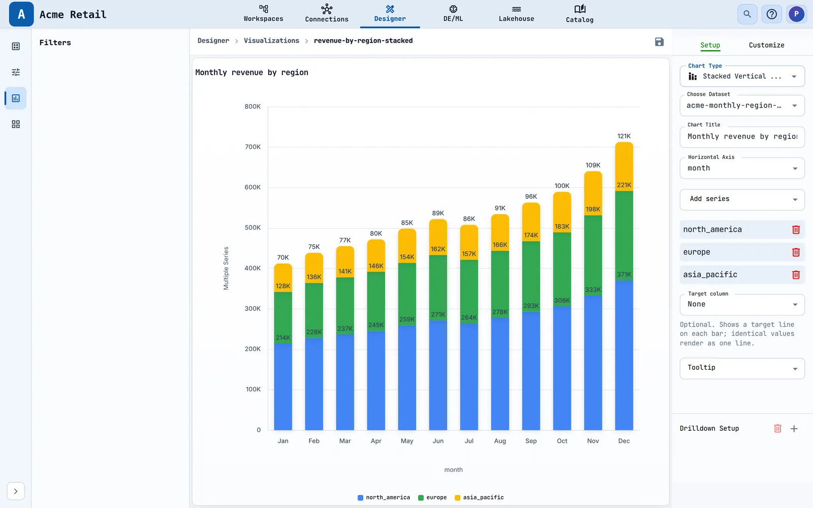
| Vertical Bar, Stacked Vertical Bar, Combo | Chart Title, Horizontal Axis, Add series, Tooltip |
| Stacked Bar | Chart Title, Vertical Axis, Series, Tooltip |
| Line | Chart Title, Horizontal Axis, Series, Tooltip, switches Add Dual Axis and Stacked Area Chart |
| Pie | Chart Title, Label, Series, Tooltip |
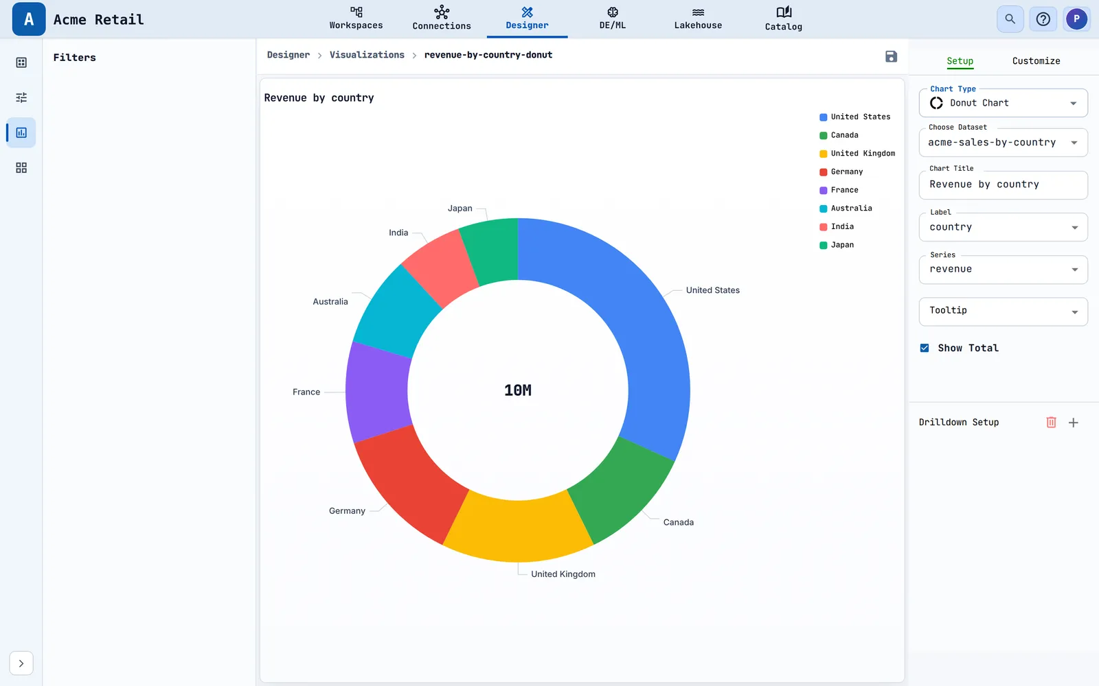
| Donut, Half Donut | Pie fields plus Show Total (draws the total in the centre) |
| Funnel | Chart Title, Label, Series, Tooltip |
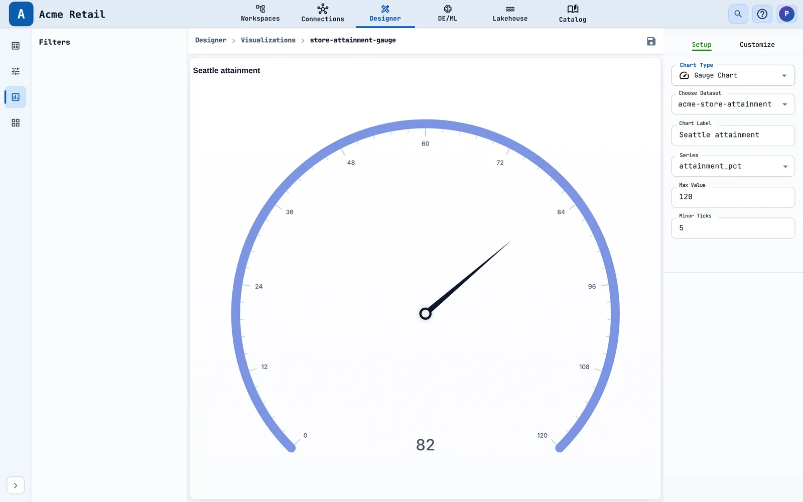
| Gauge | Chart Label, Series, Max Value, Minor Ticks (shows the first row) |
| Bubble | Chart Title, Label, Vertical Axis, Horizontal Axis, Size, Tooltip |
| Scatter | Chart Title, Vertical Axis, Horizontal Axis, Tooltip |
| Candle | Chart Title, Horizontal Axis, Low, Open, Close, High, Tooltip |
| Tree Map | Chart Title, ID, Size, Tooltip |
| Geo | Chart Title, Map Type, Region Type, Region Column, Attribute, Country, ISO Code (optional), Series, Region, map label columns (maximum 2), Tooltip, Color, Display Mode |
| Table | Chart Title, Rows Group, Column Group, Columns, Show Totals, Select Chart (sparkline type), Column Header |
| Pivot | Chart Title, Rows, Columns, Values, Show Totals, Select Chart, Column Header |
| Sunburst | Chart Title, Hierarchy Fields, Series |
| Sankey | Chart Title, Source, Target, Value (Source must differ from Target) |
| Graph | Chart Title, Source, Target, Value, Category (optional), Layout, Tooltip |
| Scorecard (Card Chart) | Chart Title, Sub Label, Add Label Column, Add Value Column, Add Sparkline Column, Sparkline Type |
See examples of finished charts#

Tables, pivots and scorecards#
Tables and pivots show data in a grid. A Table supports row and column groups, totals and a small trend chart (sparkline) in each column. A Pivot builds rows, columns and values, and loads data a page at a time. Both support conditional cell colours and symbols, which you set in the Setup and Customize tabs.


A Scorecard shows one or more labelled values with an optional sparkline.

Style the chart#
Open the Customize tab to change titles, colours, legend, axes, labels and more. It is a set of collapsible sections, and which ones you see depends on the chart type. Before the chart is set up you see "Please complete the chart setup before customizing the chart".

| Chart | Sections |
|---|---|
| Bar, Vertical Bar, Combo | Chart Axis and Titles, Chart Colors, Legend, Horizontal Axis, Vertical Axis, Gridlines, Labels, Target line |
| Stacked Bar | The above plus Total labels and Bullet layout |
| Stacked Vertical Bar | Bar sections plus Total labels |
| Line, Bubble | Chart Axis and Titles, Chart Colors, Legend, Horizontal Axis, Vertical Axis, Gridlines, Labels |
| Scatter | Chart Axis and Titles, Chart Colors, Legend, axes, Gridlines |
| Candle | Chart Axis and Titles, axes, Gridlines, Candle Stick Colors |
| Pie | Chart Axis and Titles, Chart Colors, Legend, Labels |
| Donut, Half Donut | Pie sections plus Total |
| Funnel | Chart Axis and Titles, Chart Colors, Legend, Labels, Funnel Chart |
| Gauge | Chart Axis and Titles, Labels, Gauge Chart |
| Tree Map, Sunburst, Sankey | Chart Axis and Titles, Chart Colors, Labels |
| Graph | Chart Axis and Titles, Chart Colors, Legend, Labels, Graph Settings |
| Geo | Chart Axis and Titles, Geo Chart, Labels |
| Table | Chart Axis and Titles, Header, Chart, Rows, Cells, Cells Color Spectrum, Total, Symbols |
| Pivot | Chart Axis and Titles, Header, Chart, Rows, Total, Cells, Cells Color Spectrum, Symbols |
| Scorecard | Chart Axis and Titles, Symbols, Components, Card |
What the main sections let you change:
| Section | Controls |
|---|---|
| Chart Axis and Titles | Which title to edit, Title Position, Title Padding, text, font, size, bold, italic, underline, colour, Hide Title |
| Chart Colors | One colour per series; for a pie, Select Slice and Pie Slice Color; a colour spectrum with Apply color spectrum and Inverse Spectrum |
| Legend | Legend Position (None, Top, Bottom, Right), Legend Padding, font controls |
| Horizontal / Vertical Axis | Label font, size and colour; Text Direction (Horizontal, Vertical, Inclined) on the horizontal axis; Label Format (None, Long, Short, Custom) with Prefix, Suffix, Decimal Places, Use Thousands Separator, negative-value format; Reverse Axis Order |
| Gridlines | Gridline Color, Show GridLines |
| Labels | Slice Label, Label Position (Inside or Outside), Label Angle, label format, Percentage Decimal Places, font, Hide Label, Text Border |
| Target line | Line thickness (px), Tick span (px); needs a target column in Setup |
| Total (Donut) | Font, size, bold, italic, Text Color; turn on Show Total in Setup first |
| Total labels | Distance from bar (px) and font controls |
| Bullet layout | Enable bullet layout, Scale (100% of total or Actual values), Combine categories into one bar, Show value list, Show target, Target value, Target label |
| Gauge Chart | Color Ranges (Start, End, colour), Axis Label, Value Font |
| Candle Stick Colors | Rising Color, Falling Color |
| Graph Settings | Node Shape, Node Size, Edge Width, Edge Curveness, Edge Opacity, Enable zoom and pan, Draggable nodes, Node Color, Edge Color |
Let readers drill into detail#
Outcome: clicking a bar, slice or point opens a second, more detailed chart for the value that was clicked.
- Build and save both charts. The detail chart must use the same chart type as the first one.
- In the first chart's Setup tab, under Drilldown Setup, choose the + button. Only one level is allowed, so the button is disabled once a level exists.
- In Choose Visualization pick the detail chart.
- In Select Attribute pick the column whose clicked value is passed on. Graph charts do not show this field because they pass the clicked node name.
- In Filters pick the detail dataset's filters that should receive the value.
- Save.
How to check it worked: click an element in the chart. The detail chart opens. The back arrow (Back to parent chart) returns you.
To remove the setup, choose the red trash icon and confirm "Do you really want to delete the configuration ?".
| Message | What it means and what to do |
|---|---|
| Please save valid visualization first | The chart does not exist yet. Save it, then add the level. |
| Drilldown configuration is not allowed in drilldown mode | You are already inside a drilled chart. Go back to the parent chart. |
| To toggle between setup and customize, please exit drilldown | Tabs are locked while a drilled chart is open. Go back first. |
| To save chart configuration, please exit drilldown | Saving is blocked while a drilled chart is open. Go back first. |
| Error occurred while fetching drilldown data | The detail dataset could not be queried. Open that dataset and run it. |
Rename or delete a visualization#
Open Actions on the row.

- Rename opens a dialog with Visualization Name, filled in already. Names follow the same rule. Toast: "
renamed successfully". - Delete asks
Are you sure you want to delete "<name>" ?Toast: "<name> deleted successfully".
Warning
Dashboards that still use a deleted visualization cannot draw that tile. They show "Failed to fetch data:
What to know#
- A chart can have one drilldown level.
- Large tables and pivots load in pages (500 rows at a time for table queries).
- A visualization works with the dataset's filters. Readers' filter choices are not saved with the chart (chapter 2).
Troubleshooting#
- The canvas says "Complete Chart Setup". The chart is missing a type, a dataset or a required field. Choose all three in the Setup tab.
- The Series list is empty. The dataset returned no numeric columns. Open the dataset and check its query.
- "Error occurred while fetching data." The dataset query failed. Open the dataset and run it to see why.
- I changed something and it is gone. You did not choose Save. Choose the floppy-disk icon before leaving.
- "Error occurred while updating visualization". The save failed. Check your connection and try again. If it keeps failing, ask your administrator to check your Visualization permissions.
- The list says "Unable to fetch data". Reload the page.
Related chapters#
- Chapter 2 explains filters that appear in the left pane.
- Chapter 3 places visualizations on dashboards.
- The Build and Run guide explains datasets.